Hythane
Technologies.
A from-scratch rebuild of hythanetech.com for an Indian deep-tech manufacturer building the country's first fully-indigenous industrial gas-detection stack. Single-page scroll, custom SVG everywhere, an interactive 17-gas configurator, and zero JavaScript framework.
The brief.
Rebuild hythanetech.com from the ground up. The existing site was a generic template that didn't reflect the technical depth or international ambition of the company.
- Feel professional but not boring corporate — international polish, not "Indian SaaS landing page".
- Light mode throughout — no dark mode. The audience is procurement officers and safety engineers reading on bright office monitors.
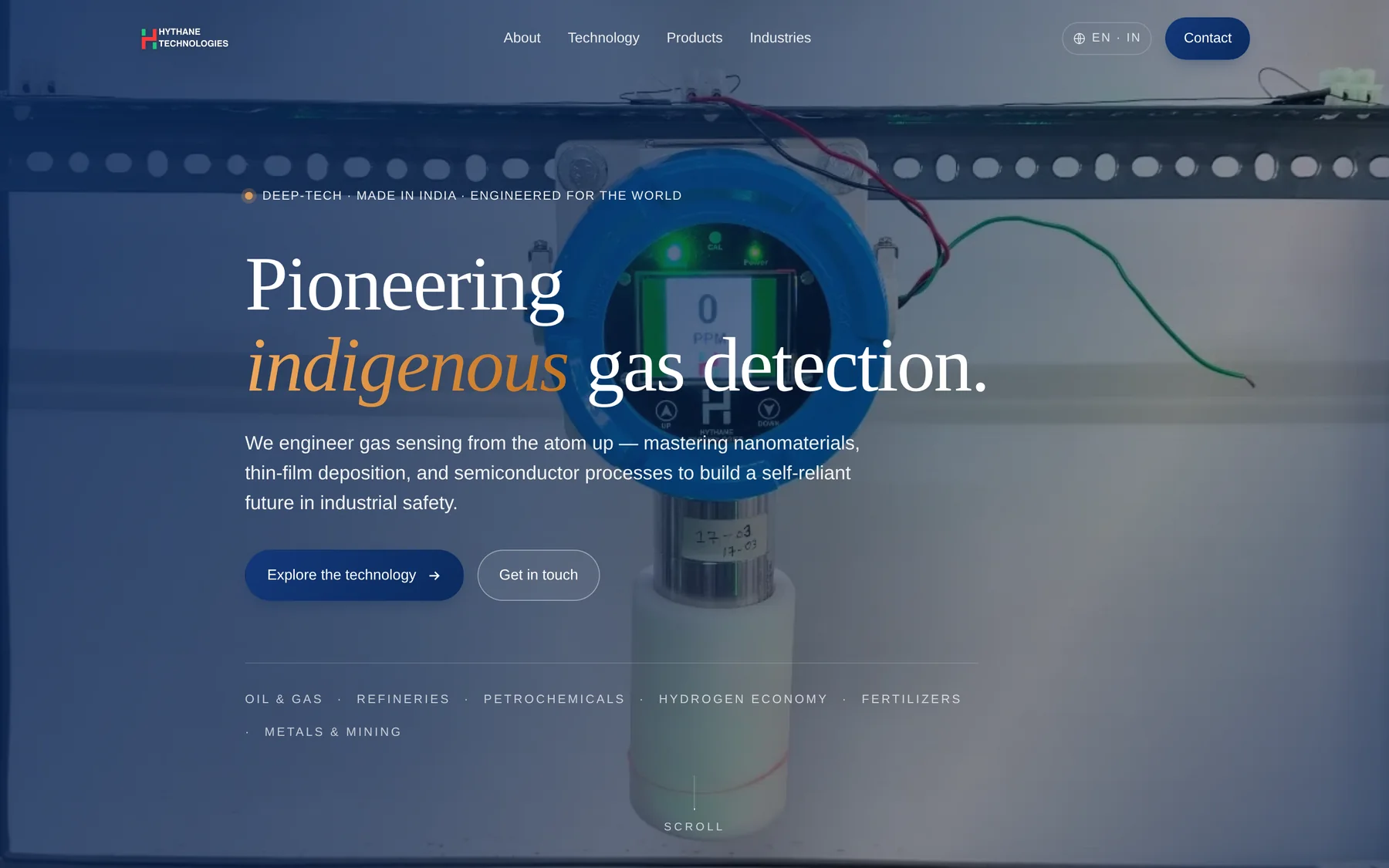
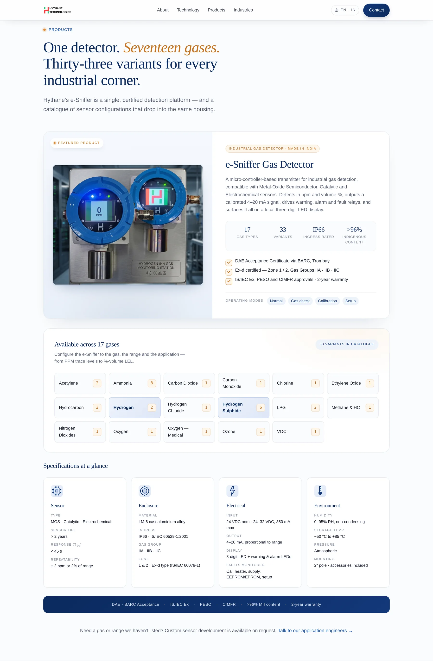
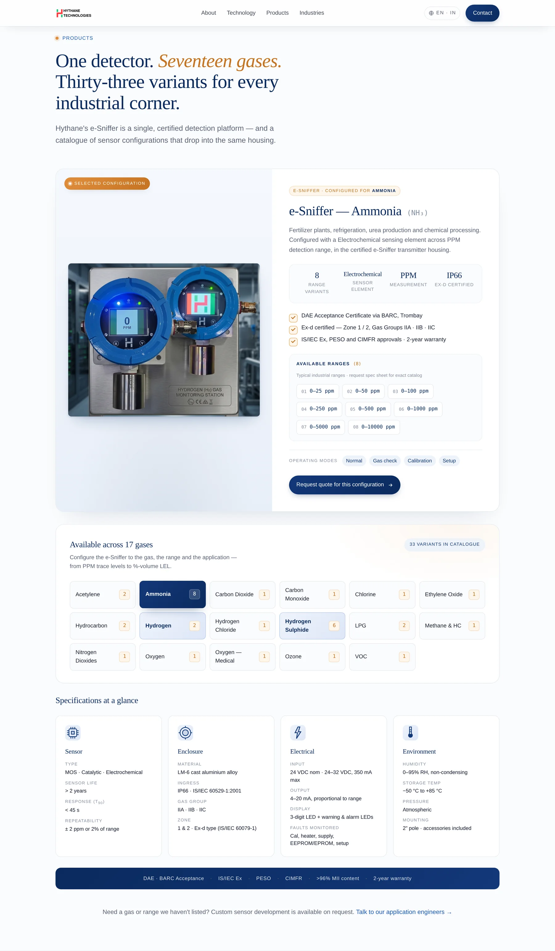
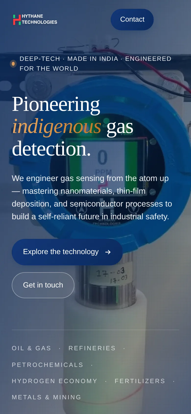
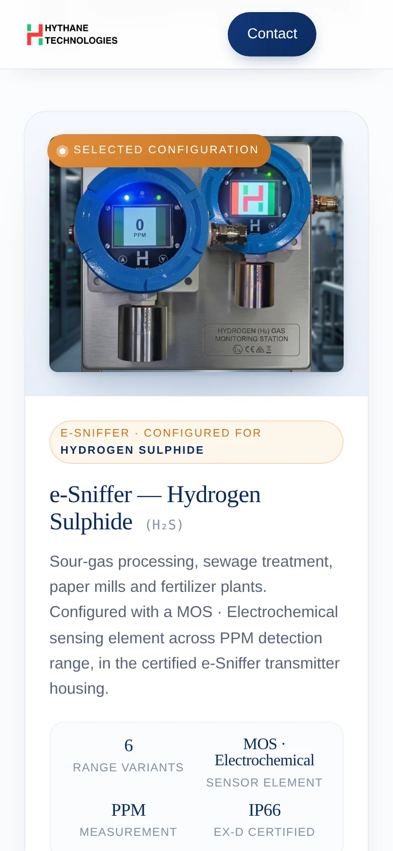
- Showcase the e-Sniffer product platform front and centre — 17 industrial gases × 33 configuration variants made tangible to a buyer.
- Read as an engineering company, not a marketing one.
- Deployable to a static host (Netlify) with no backend, no CMS, no monthly maintenance.
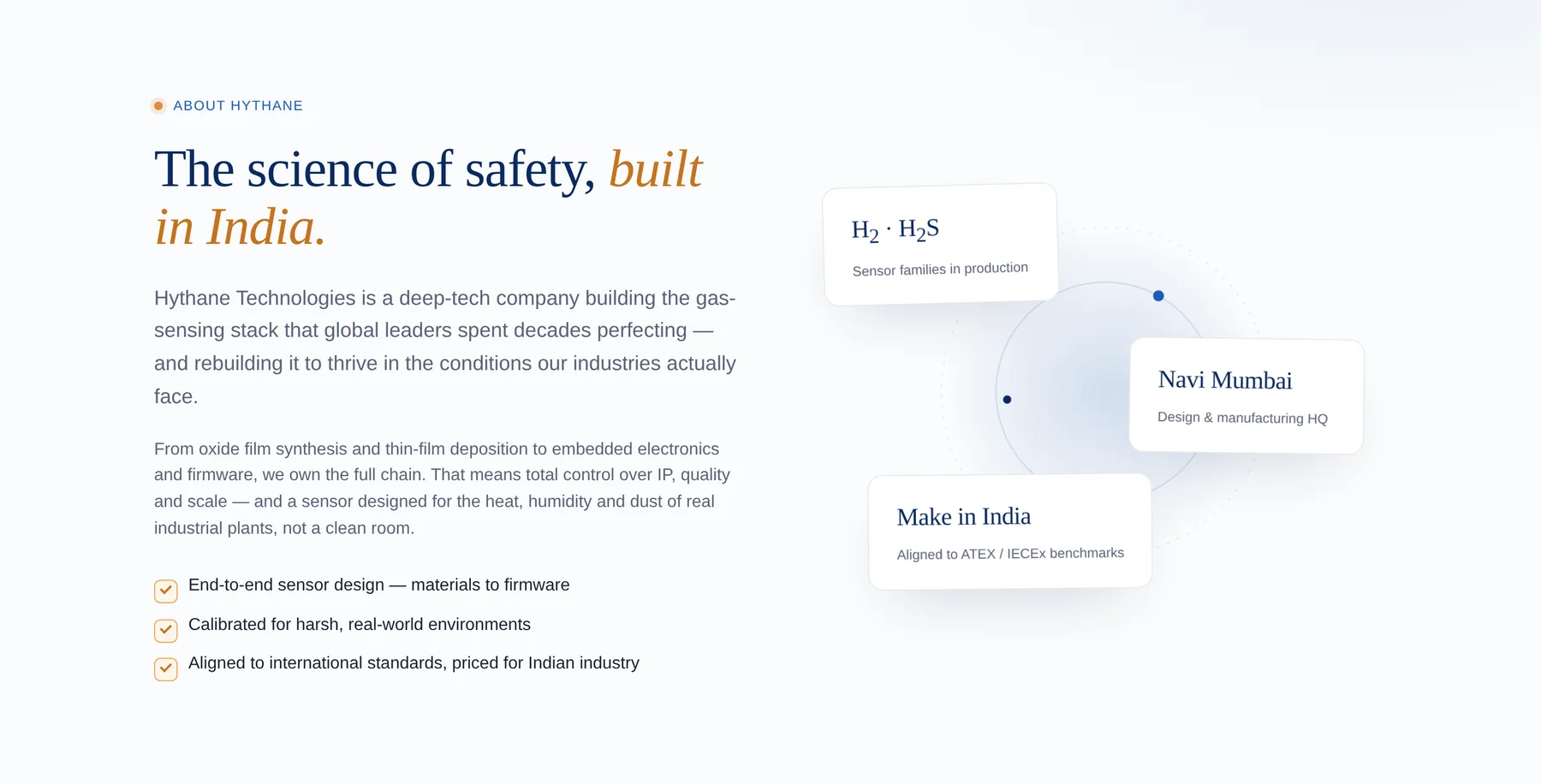
The company.
Hythane Technologies designs and manufactures the e-Sniffer — a micro-controller-based gas-detection transmitter compatible with MOS, Catalytic and Electrochemical sensing. End-to-end IP ownership from oxide-film synthesis to firmware gives them a 30–50% cost edge over imported solutions.
Five decisions that shaped the build.
Every choice came from a buyer mindset — what would a safety engineer or procurement officer need to see to take this seriously?
Single page, not multi-page
Hythane's pitch is one story told well. Splitting it across five routes would have diluted it. Scroll-driven narrative kept the energy: hero → trust ticker → about → technology → products → industries → made-in-India → contact.
Light mode only
Industrial-safety buyers read product collateral on bright office monitors. Dark mode would have felt like a consumer-tech site, not a serious supplier. The result reads "global supplier" without leaning on dark glassmorphism trends.
Custom SVG, zero stock
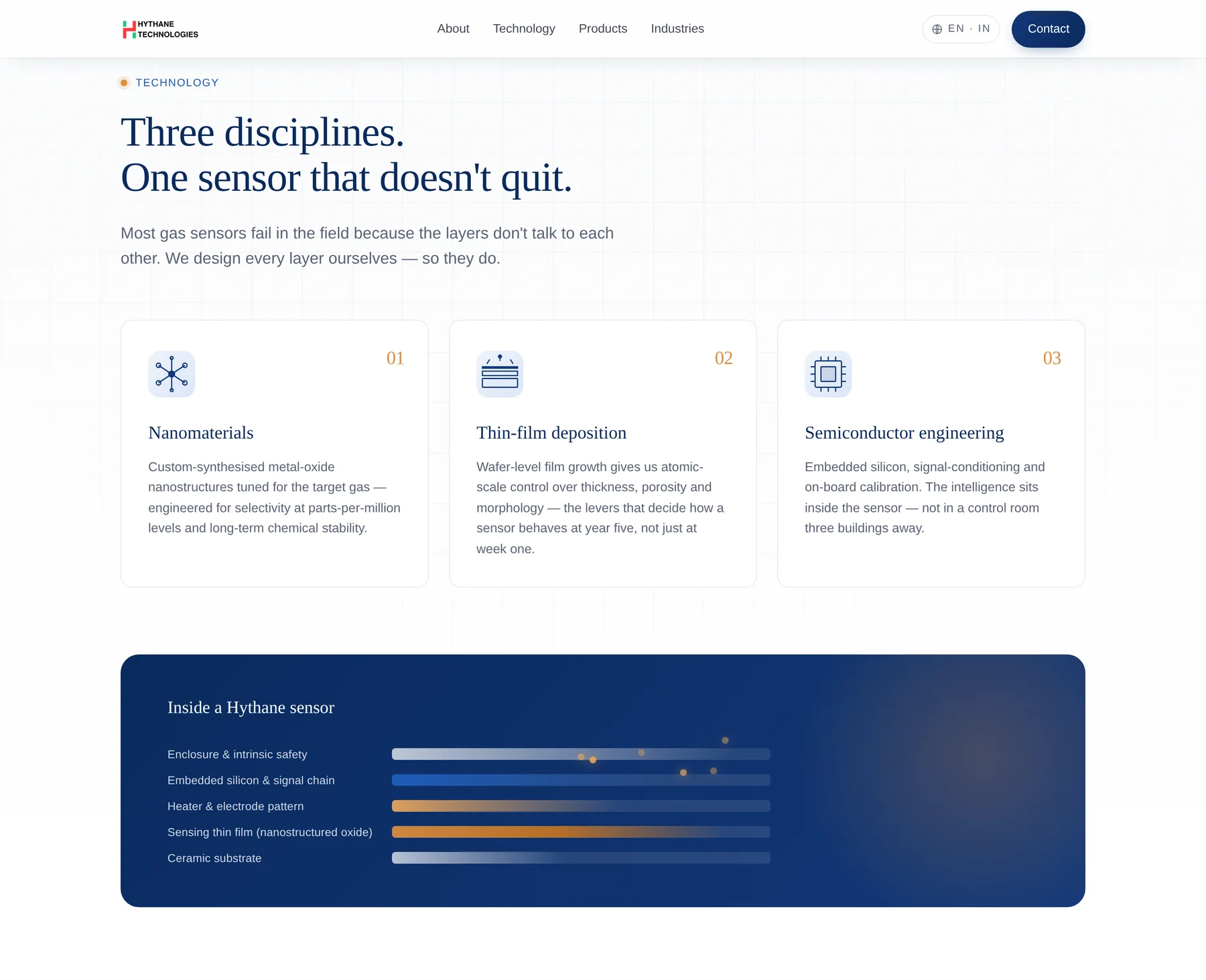
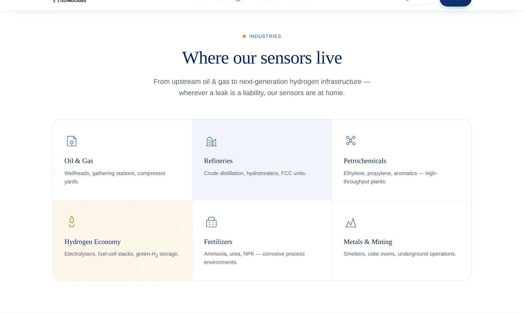
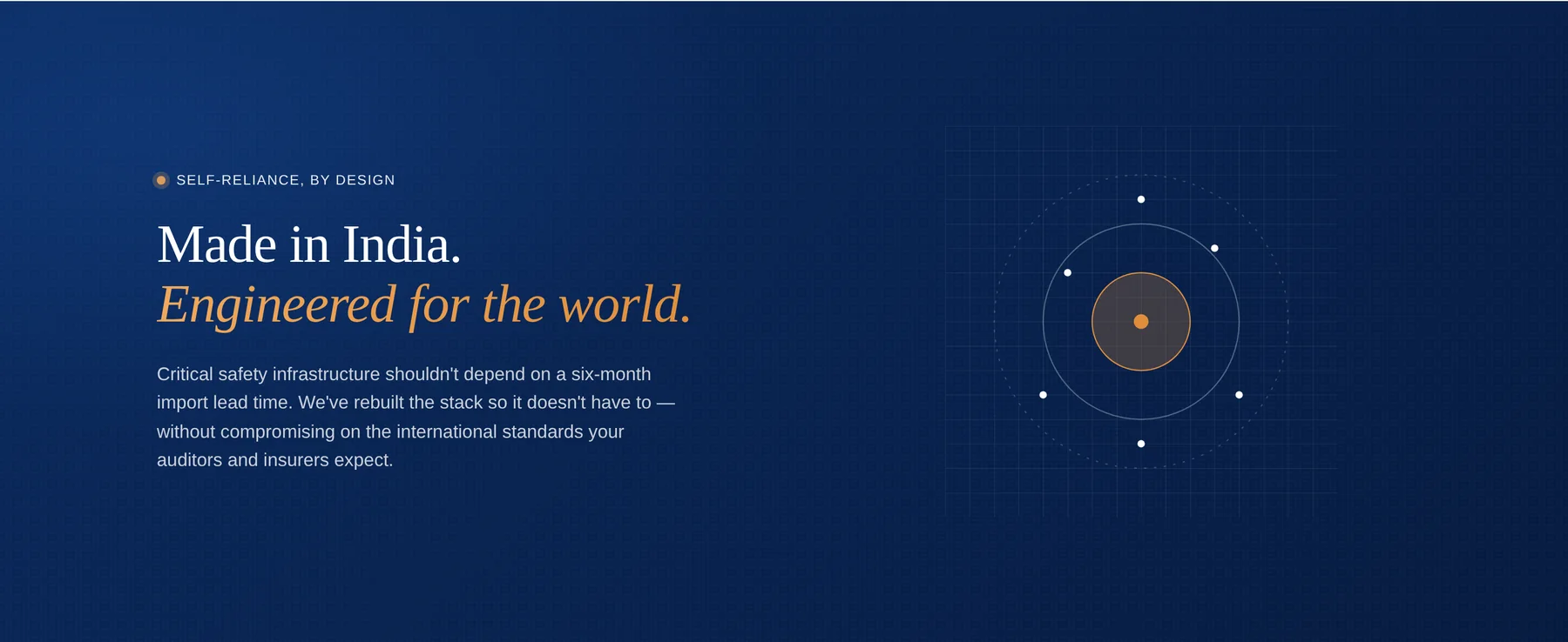
Many Indian engineering company sites are visually flat — black text on white, stock cargo ships, clip-art icons. We invested in custom illustration in every section: a sensor-stack diagram with animated gas molecules, a globe-and-grid in the Made-in-India banner, bespoke industry and pillar icons. Six custom industry icons, three technology pillars, four spec pillars. Zero icon fonts. Zero stock photography.
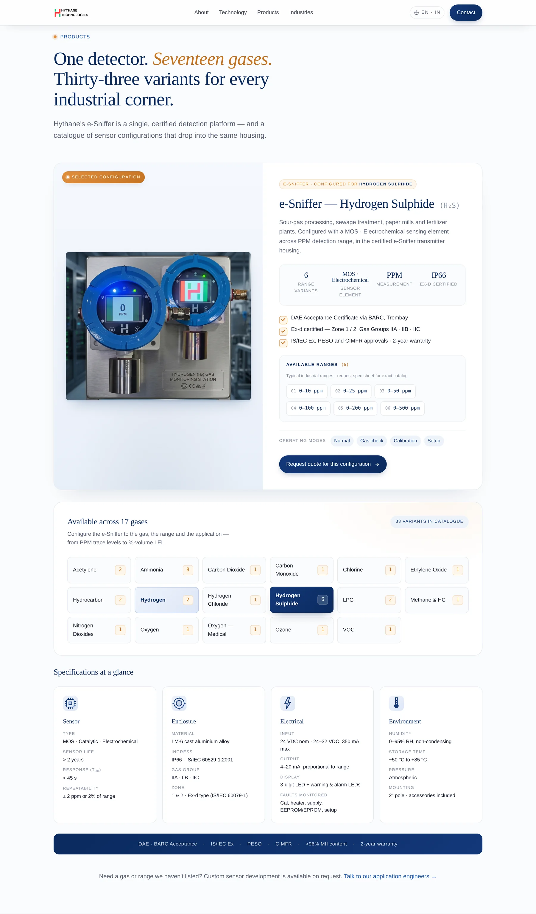
Interactive 17-gas configurator
The original site listed 17 supported gases as a static menu. We turned that into a real interaction — click a gas, the product reconfigures: title, sensor technology, range options, applications copy, variant pills, and a "Request quote" CTA that pre-fills the contact form with the selected gas. The entire 17-gas catalog lives in a single well-commented JS object; updating it is a one-line edit.
No JavaScript framework
React/Next would have added a build step, deploy pipeline complexity, and a 200+ KB framework cost for a site that needed ~330 lines of vanilla JS. Faster page loads, easier handoff to a non-developer, and a deployable artifact that runs identically anywhere static files run.
The technology, made tangible.
Sensor-stack diagram with animated gas molecules. Three discipline pillars — nanomaterials, thin-film deposition, semiconductor electronics — explained without jargon.
The product is the hero.
The centerpiece: the e-Sniffer block with certifications and key stats, and below it a clickable grid of all 17 supported gases — each with variant counts. Click any gas and the featured product updates in real time. Click again to deselect.
From the field.
Six industries served — oil & gas, refineries, petrochemicals, the hydrogen economy, fertilizers, metals & mining — each with a bespoke SVG icon. And a closing Made-in-India banner with a custom globe-and-grid graphic in the brand's deep navy and warm amber.
Tech stack.
A small, durable stack — no framework, no build step, no database. The same files run identically in any browser, on any host. Provider-swappable everywhere it mattered.
Front-end
Typography
Asset pipeline
Deployment
Mobile, tested down to 390px.
Mobile-first single-column under 600 px, 2-column grids 600–980 px, 3–4 column on desktop. Hero video, the configurator, every section — verified at 390 px and up.
The outcome.
An engineering site that looks like one — credible, restrained, technically honest, and built to be edited by whoever inherits it.
For the business
- An engineering-confident voice — reads like a serious global supplier, not a templated B2B landing page.
- The product catalog made browsable — 17 gases × 33 variants explorable in a single interaction.
- A quote funnel that captures the gas in question — the contact form arrives pre-filled with the visitor's selected gas, removing the first round of back-and-forth.
- Zero maintenance debt — no framework upgrades, no plugin patches, no CMS to keep alive. Static files, edit and re-upload.
For the visitor
- Hero video paints instantly — first-frame JPEG poster shows under 100 ms; the looping video streams in behind it.
- An interactive way to explore the catalog — click a gas, see exactly what's available, request a quote in two taps.
- Honest UX — variant ranges clearly labelled as "typical industrial ranges, request spec sheet for exact catalog". No fabricated specs.
- Accessible — semantic
<button>on chips,aria-pressedstate, prefers-reduced-motion respected throughout.
Have a brief?
If you're an engineering company tired of looking like every other engineering company on the internet — we'd love to hear about it.
Start a project

