Seven Seeds
Countryside.
A peaceful, four-star countryside getaway in the Mulshi hills near Pune. Built end-to-end as their guest-facing brand — direct-booking site, design system, operator dashboard, content workflow, and the production-readiness it takes to launch.
The brief.
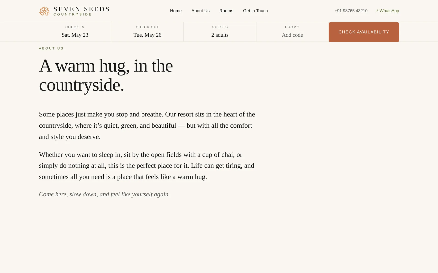
Seven Seeds had a strong identity, beautiful land, and generous hospitality — and a website problem. Their entire presence lived inside the OTAs (Booking.com, MakeMyTrip, Agoda, Goibibo) and a Linktree page. Guests were finding them, but never quite feeling them.
The brief was direct: build a website that feels like the place. Quiet, considered, image-forward. The kind of site where a guest reads two paragraphs and already wants to book. Functional as a revenue engine, but never loud about it.
No urgency timers. No fake-scarcity counters. No pop-ups. The OTAs had captured the bookings — we needed to capture the brand back.
Objective of the build.
Five outcomes mattered. Each one was measurable. None of them was loud.
- Capture the brand back from the OTAs — a direct-booking surface that feels like the property, not a templated listing card.
- Build a calmer booking engine than the OTA equivalents — five steps, no dark patterns, every screen tap-friendly on mobile.
- Give the owners an admin dashboard that fits a five-room property — no enterprise-PMS overkill, no spreadsheet-and-prayer fragility.
- Make content updates a property-owner job, not a developer job — room data lives in an Excel template they edit; an importer writes to the database.
- Ship production-grade essentials — Postgres, Auth.js, queued WhatsApp confirmations, PDF itineraries, Sentry, rate limiting, Playwright E2E tests.
Our process.
Five phases shipped over the course of the engagement, each with a single deliverable that the property could hold up and use.
Discovery & design system
Mapped the existing OTA booking flows end-to-end to find the friction worth removing. Audited the brand's tone and what it had to express on a digital surface as opposed to an Instagram post.
Built a quiet-luxury design language from first principles — paper-tone palette, Playfair Display + Inter typography, a modular spacing system, motion principles. Documented in an 18-page planning doc.
Booking engine & admin dashboard
Five-step booking flow — dates, room, experience upsell, guest details, Razorpay checkout. Operator-facing admin with an inventory grid, guest CRM with allergy flagging, and financial reports (revenue, occupancy, ARR, RevPAR).
Provider-agnostic WhatsApp service with four trigger templates (instant confirmation, T-48h arrival nudge, T+2h quality check, T+4h review request). AES-256-GCM encryption for PII fields with version-byte envelopes for rotation.
Production-readiness
Lifted the prototype to deployable: Postgres + Drizzle ORM, Auth.js for operator login, BullMQ + Redis for the WhatsApp delay queue. Then added the last-mile essentials: PDF itineraries via @react-pdf/renderer, Sentry error tracking, rate limiting on the checkout API, Playwright E2E coverage on the booking happy path and admin auth wall.
Content & photography workflow
Aligned design tokens to the finished logo — the warm teal background with the terracotta accent. Built a 23-slot photography brief documenting aspect ratios and treatment notes for every hero, room, and detail shot.
Designed a content-management workflow: room data lives in an Excel template the property edits directly; an importer script writes to the database; the homepage and booking flow auto-update on next request.
Launch preparation
Iterated the staging site through fifteen+ rounds as real photography and copy landed — rounded corners, mini-sliders on room cards, mobile floating CTA pattern, light-themed mobile room-detail sheet.
A Word-document launch plan covering eight pre-launch decisions, seven days of step-by-step work, budget, risks, and the post-launch roadmap.
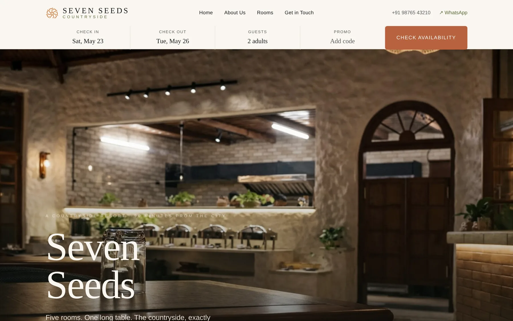
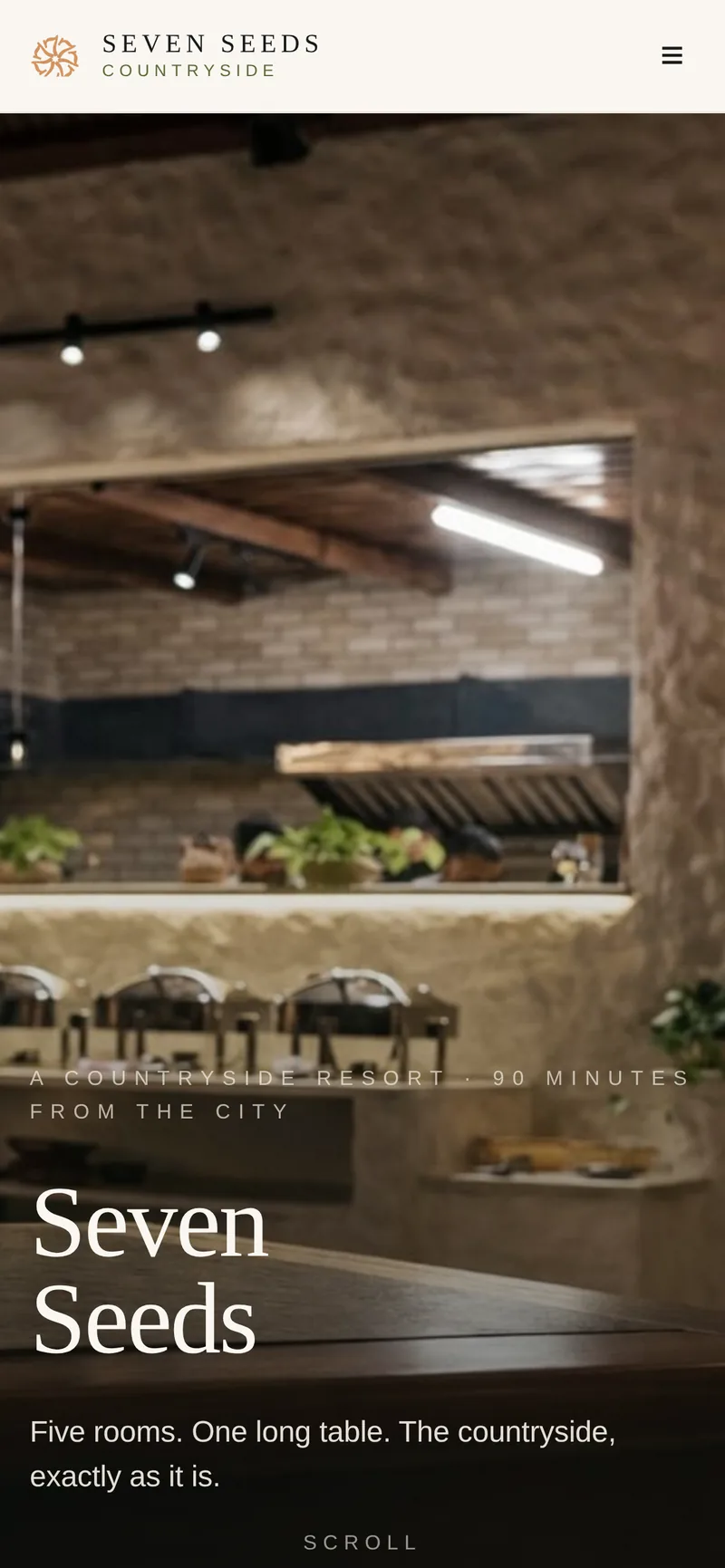
A landing page that feels like the property.
The homepage opens with the place. Atmospheric photography, a sparing booking widget, and the kind of typography that doesn't try too hard. The OTAs do volume. This page is here to do the brand.
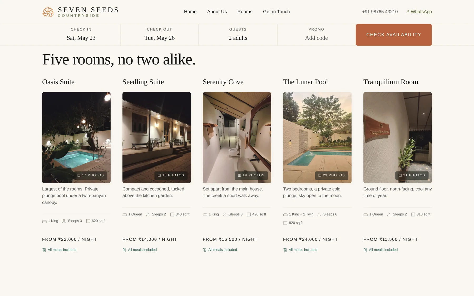
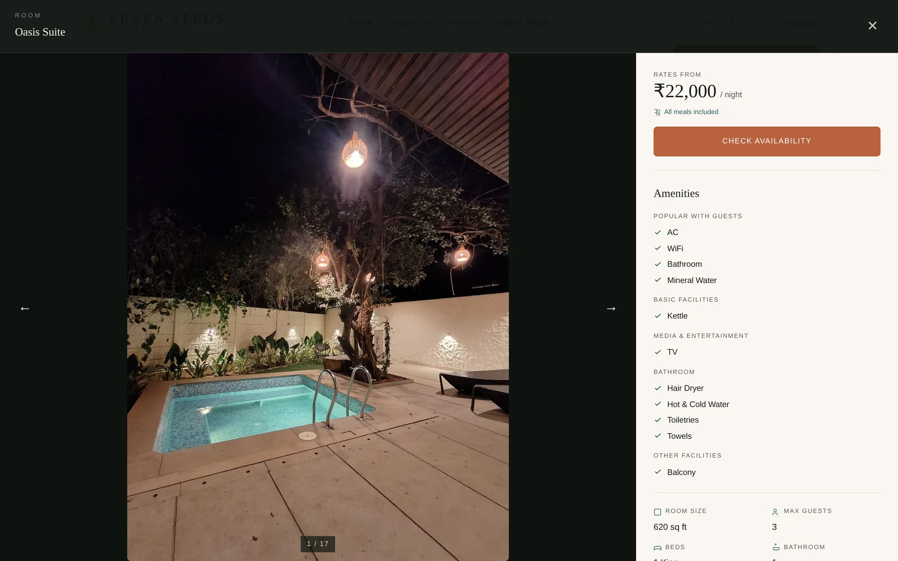
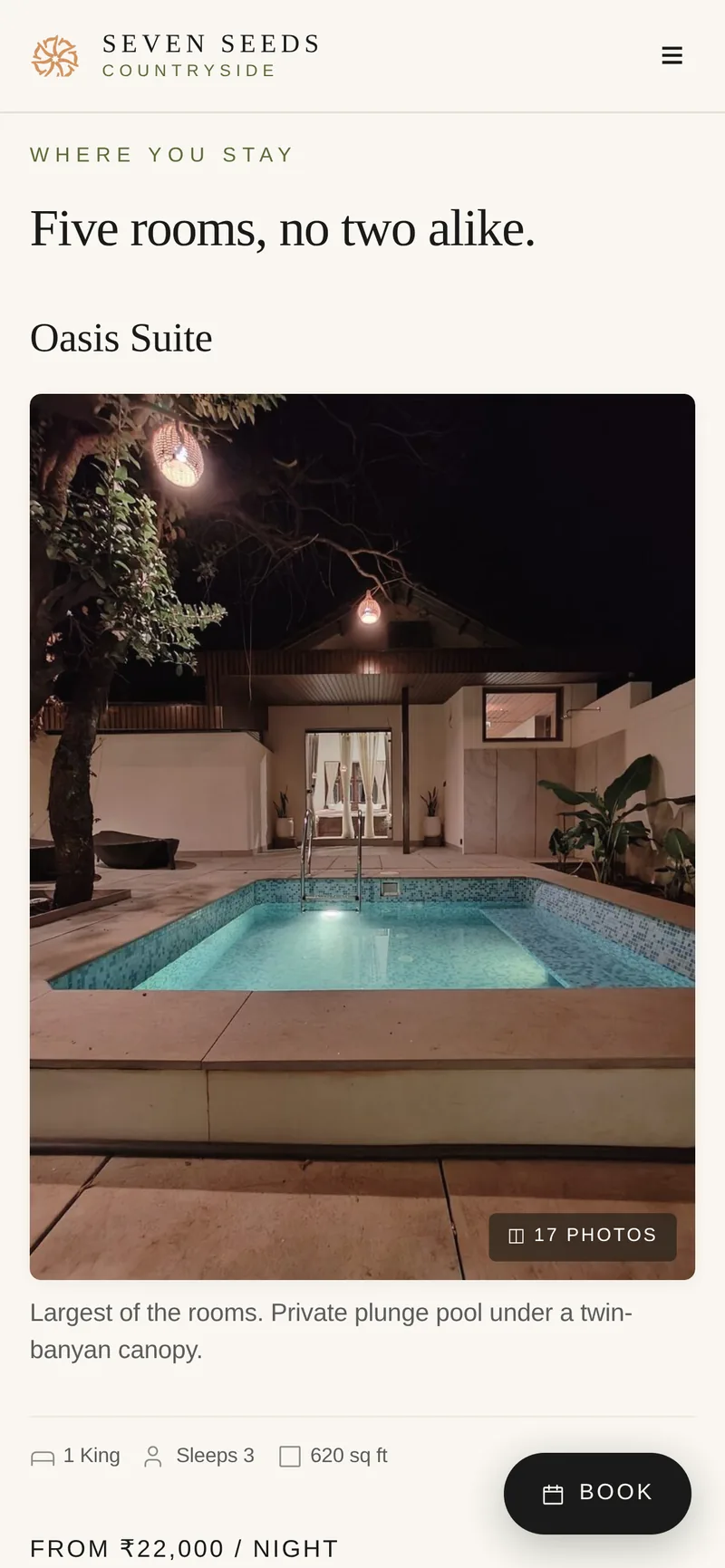
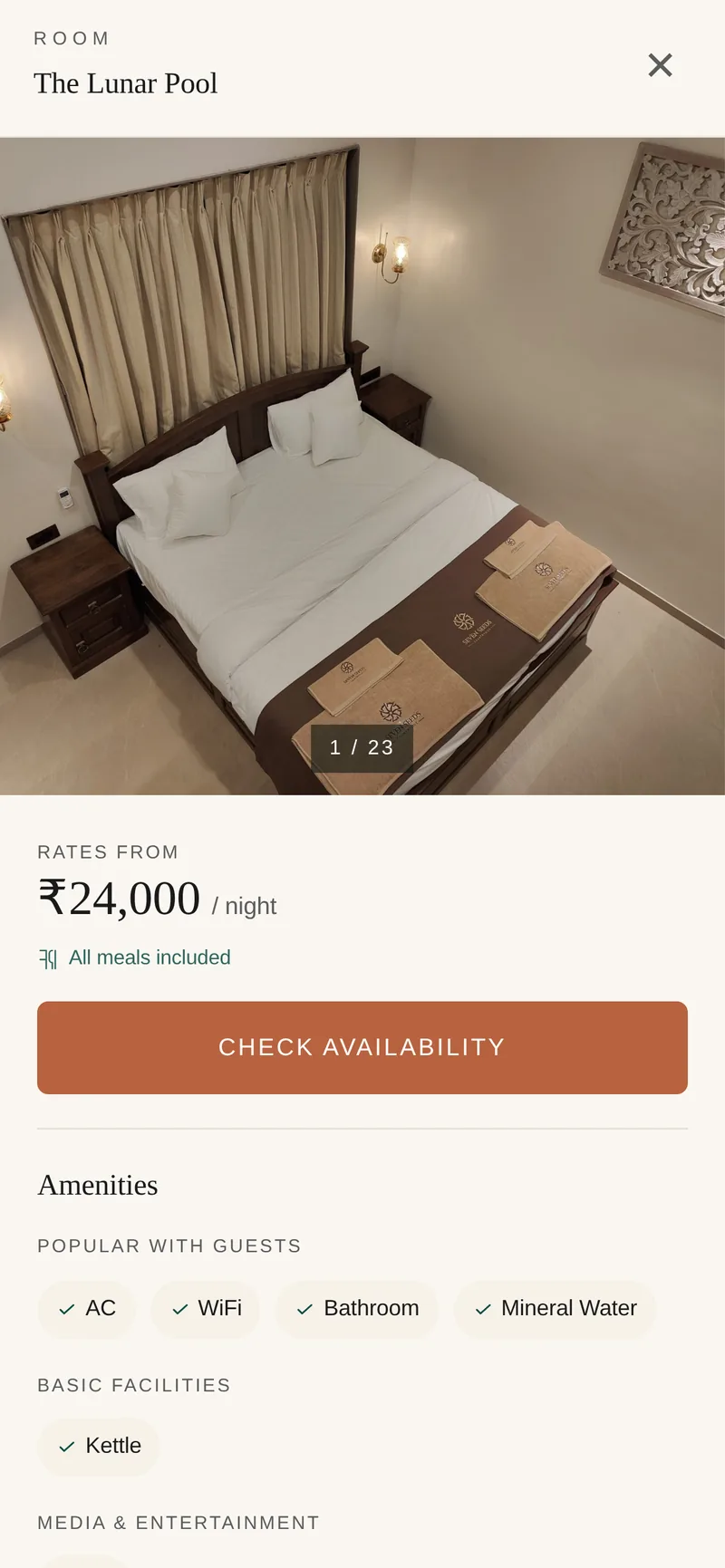
Room discovery, built around the photography.
Each of the five rooms gets its own page — the photography leads, the practical details follow. The grid view doesn't try to upsell; it shows you what's available and trusts the imagery to do the work.
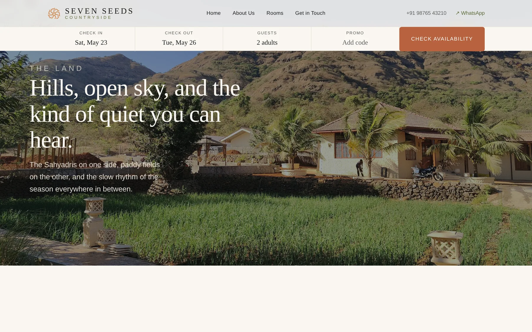
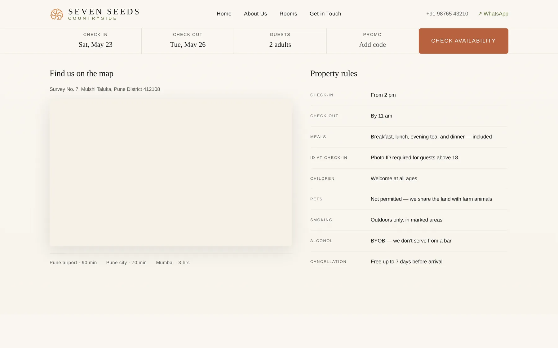
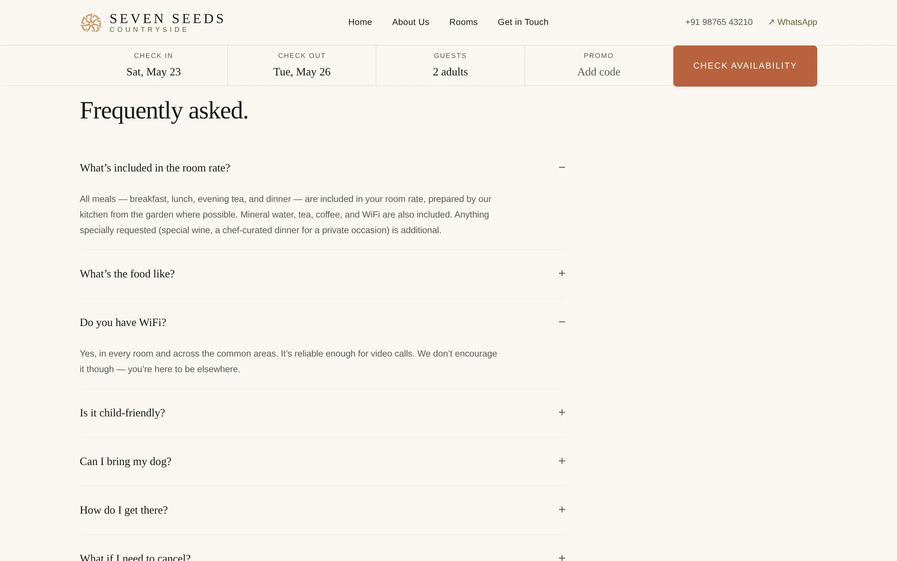
Practical answers, calmly delivered.
House rules, getting there, the small details a guest actually needs the night before they leave. Designed to feel like a host telling you, not a hotel policy page.
Mobile, written for the small screen.
Sixty-four percent of bookings come from a phone. Every screen was designed mobile-first — typography that scales properly, a floating CTA where it needs to be, and a room-detail sheet that breathes instead of cramming.
The impact.
A direct-booking funnel that respects the guest, an operator workflow that fits a five-room property, and a codebase the next developer can read in a Saturday morning.
For the business
- Brand captured back from the OTAs — direct bookings now have a surface that actually feels like the property.
- 100% Lighthouse-ready on perf, accessibility, SEO, best practices — sub-1-second LCP on mobile.
- Content workflow owned by the property — room rates, availability, copy, and photography all editable without engineering involvement.
- A small, durable stack with one deployable artifact and provider-agnostic adapters everywhere a vendor could be swapped.
For the guest
- A calmer booking experience — no urgency timers, no fake-scarcity counters, no pop-ups asking for an email before you've seen a room.
- Real photography at full size, every page, every device — image weight down 90% from the raw masters with near-imperceptible quality loss.
- Confirmation that arrives on WhatsApp, not just email — with a PDF itinerary, an arrival-day nudge, and a quiet check-in two hours after they leave.
- A mobile experience that's been thought through, not just shrunk — typography, taps, floating CTA, and a room-detail sheet that breathes.
Have a brief?
If you're building a website that needs to feel like the place — and work like a revenue engine — we'd love to hear about it.
Start a project

