
Freshline
Floriculture.
A 30-year Indian rose grower and consolidator, supplying the UK and the Netherlands — with almost nothing to show for it online. We built the brand a home of its own: a calm, credible, image-forward site that finally looks like the business behind it.
The brief.
Freshline has grown and consolidated Indian roses since 1993, shipping to supermarket chains and wholesalers across the UK and the Netherlands. Three decades of trade — and buyers only ever met them through intermediaries, never a brand.
The brief arrived with a clear reference — a Kenyan grower's website the client admired — plus their logo, brand colours, and a deck of copy. The ask was specific: adopt that calm, credible, editorial structure, but make it unmistakably Freshline. A page that reads like a serious sourcing partner, not a florist.
Content was fixed; design was open. Everything on the page had to come from Freshline's own material — the company story, the differentiators, the growing regions — dressed in an identity built around their red rose mark.
Objective of the build.
Four things had to be true when the page went live.
- Reposition the brand — move Freshline from marketplace anonymity to a direct presence that reads as an established, trustworthy grower.
- Mirror the reference, don't copy it — adopt the light, card-based structure the client found credible, re-skinned entirely in Freshline's rose-red and green identity.
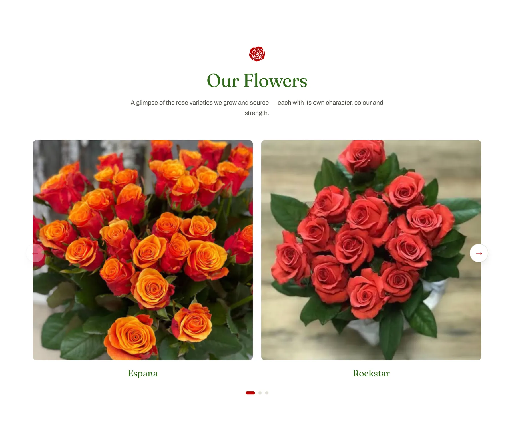
- Show the flowers — a variety showcase built from the client's own rose photography, front and centre.
- Ship a fast, deployable site — a static build a non-technical team can host anywhere, ready for a drag-and-drop deploy.
Our process.
Five phases, each ending in something the client could hold up and use.
Direction & references
Broke the reference site down section by section — the two-tier nav, the badge row, the feature cards, the footer — to understand what made it read as trustworthy. Extracted the official logo and brand palette, and pulled the site copy straight from the client's deck.
Isolated the red rose mark from the logo lock-up so it could work as a recurring motif — nav, favicon, section icons, and a rotating certification-style stamp.
Design system
Built a light, botanical identity from the brand's two colours — rose-red (#BB0000) and green (#5BA11E). Legible green headings, red accents and calls-to-action, warm-grey body copy, all on a paper-white base, with a deep-green footer and a red action bar to close.
Paired an editorial serif (Fraunces) with a clean grotesque (Archivo) — restrained enough to sit under a corporate buyer's eye, warm enough to feel like flowers.
Build
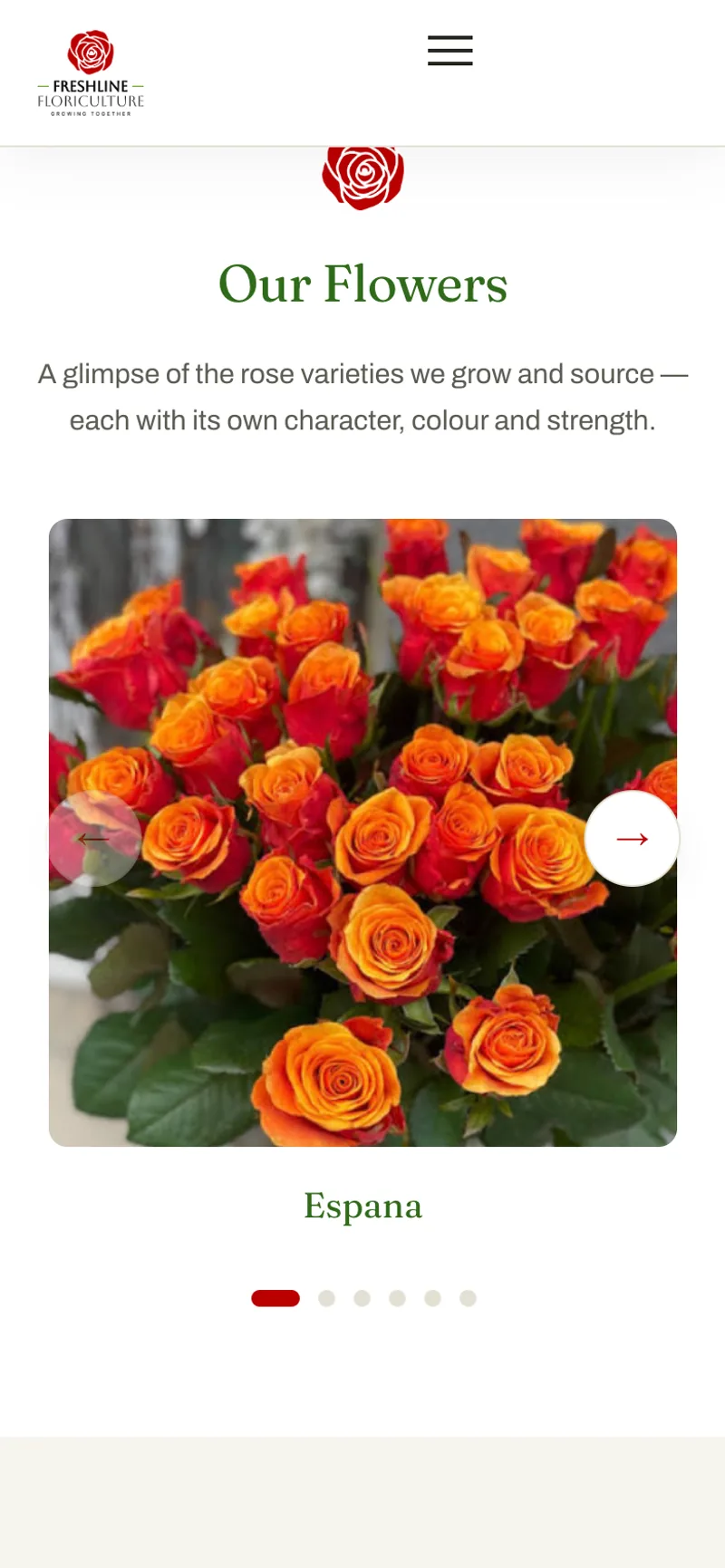
Hand-authored static HTML, CSS and JavaScript — no framework, no build step. GSAP-driven scroll reveals, a two-up "Our Flowers" variety slider with autoplay, arrows, dots and touch-swipe, a rotating stamp, and a brand preloader. Every effect is progressive, accessible, and honours prefers-reduced-motion.
Imagery
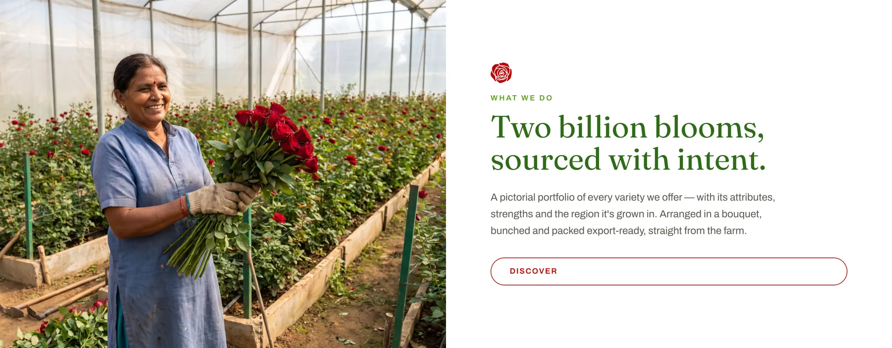
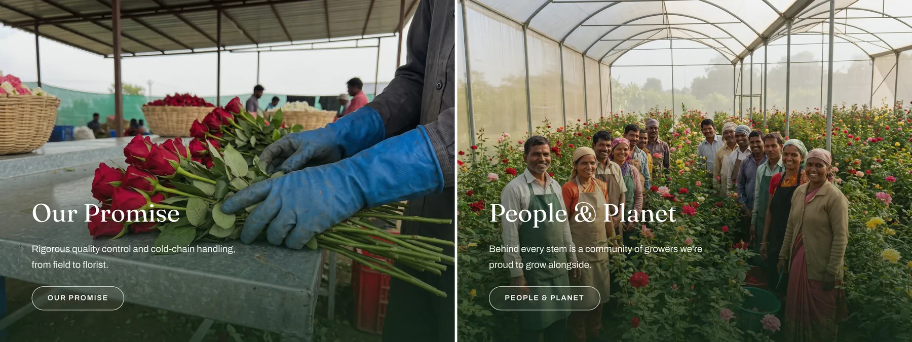
Produced a set of Indian rose-farm and grower images to brief — the hero field, a grower with cut stems, the packing bench, the team in the greenhouse — then placed the client's own rose-variety photography in the collection slider. Everything optimised to WebP, with image weight down dramatically from the raw masters.
Launch preparation
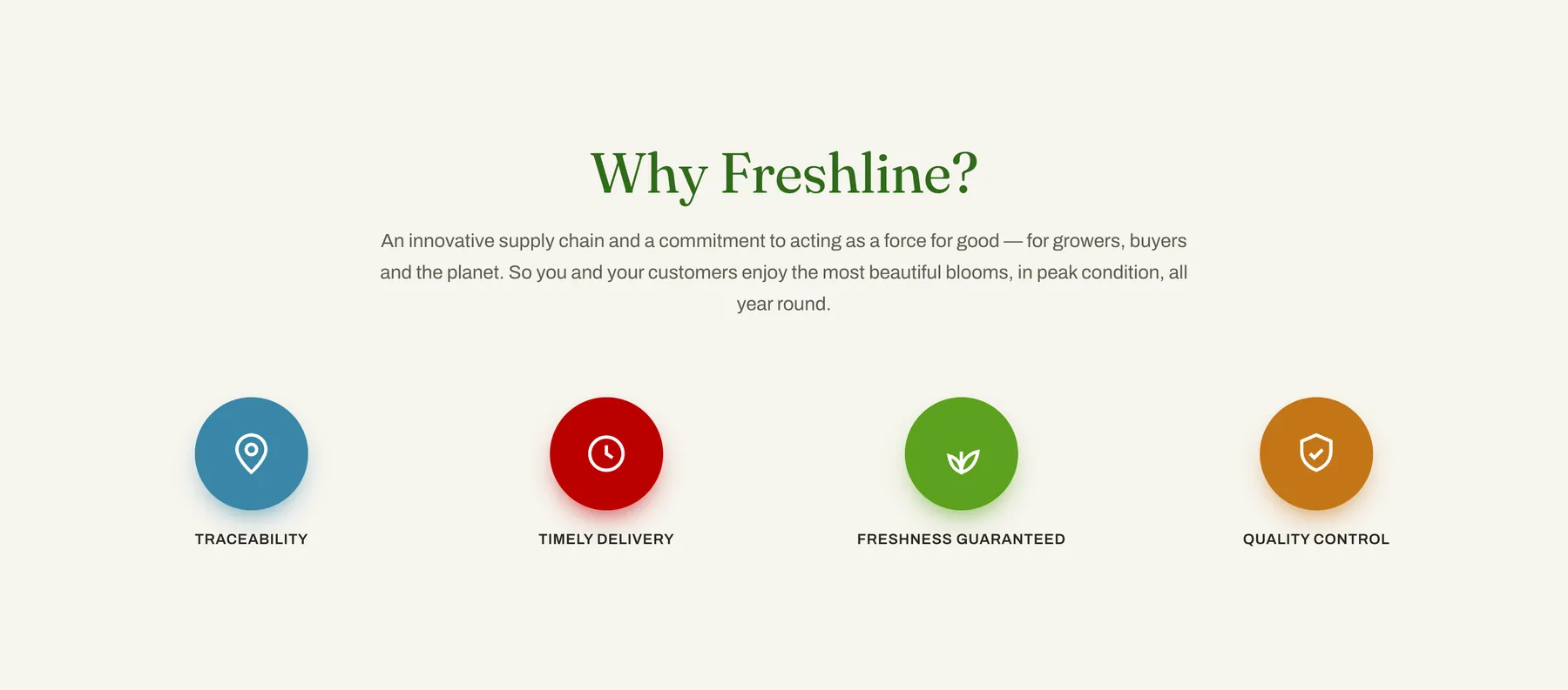
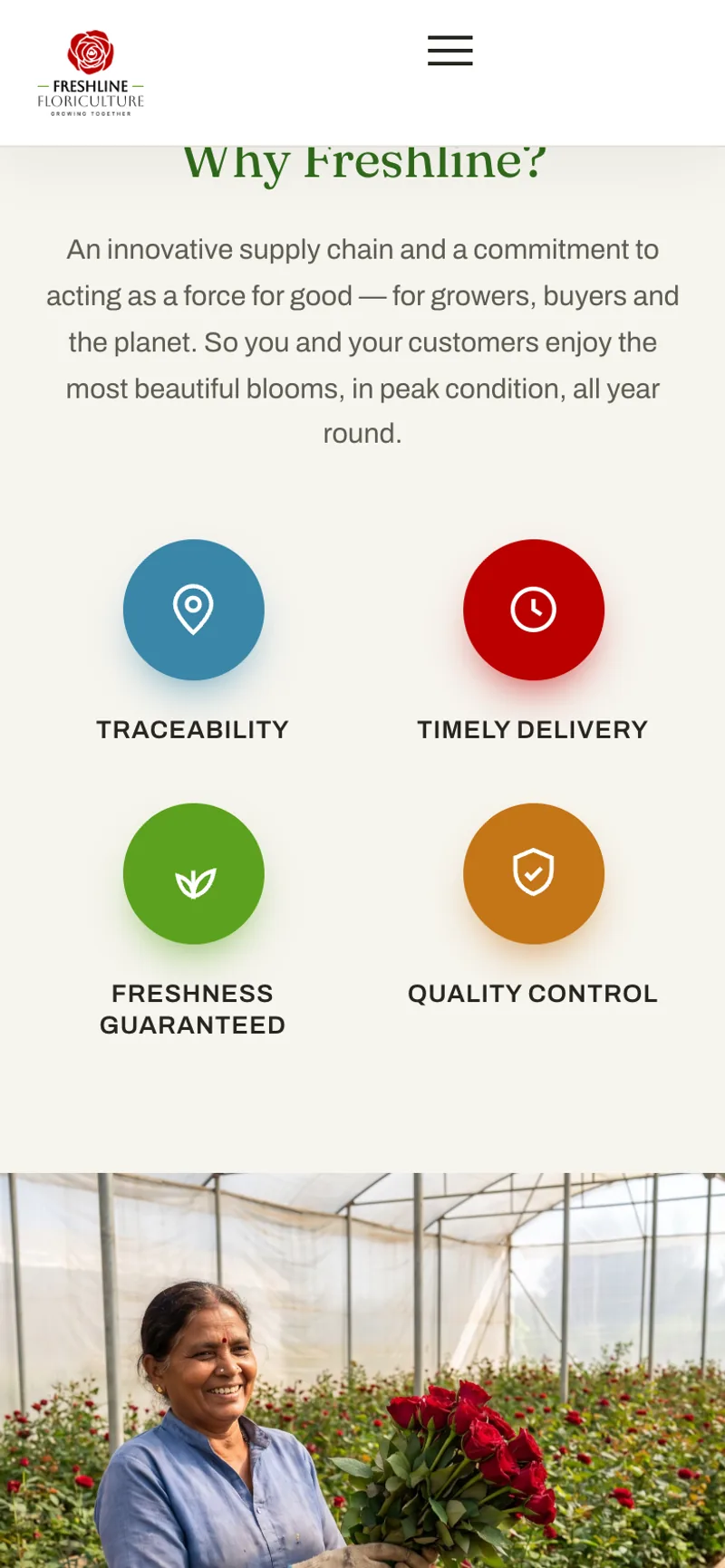
Iterated through content passes as the client refined the story — the differentiators settled to four (Traceability, Timely Delivery, Freshness Guaranteed, Quality Control), the flowers section was rebuilt as a slider, and the navigation was aligned to match.
Packaged as a Netlify-ready bundle with a full handoff document — structure, colour tokens, how to swap imagery, and the placeholders to replace before go-live.
A homepage that reads as a grower, not a listing.
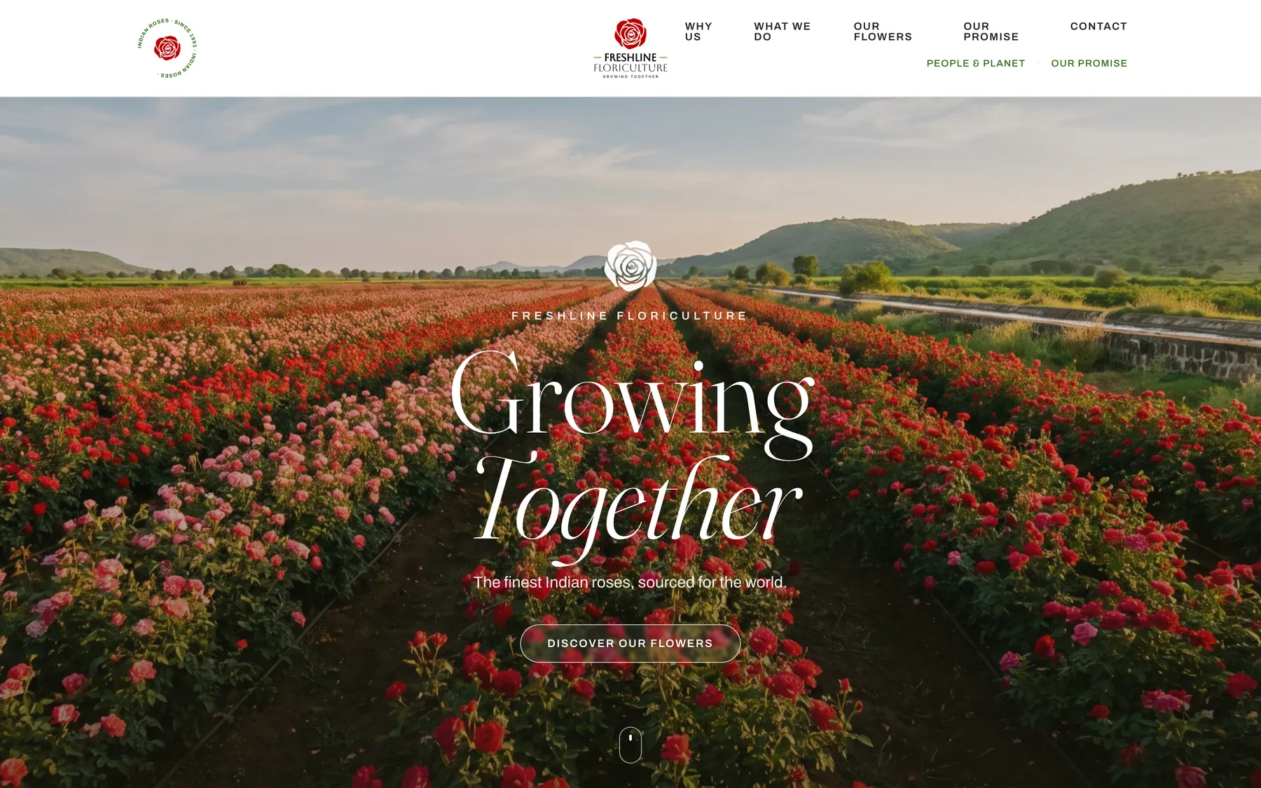
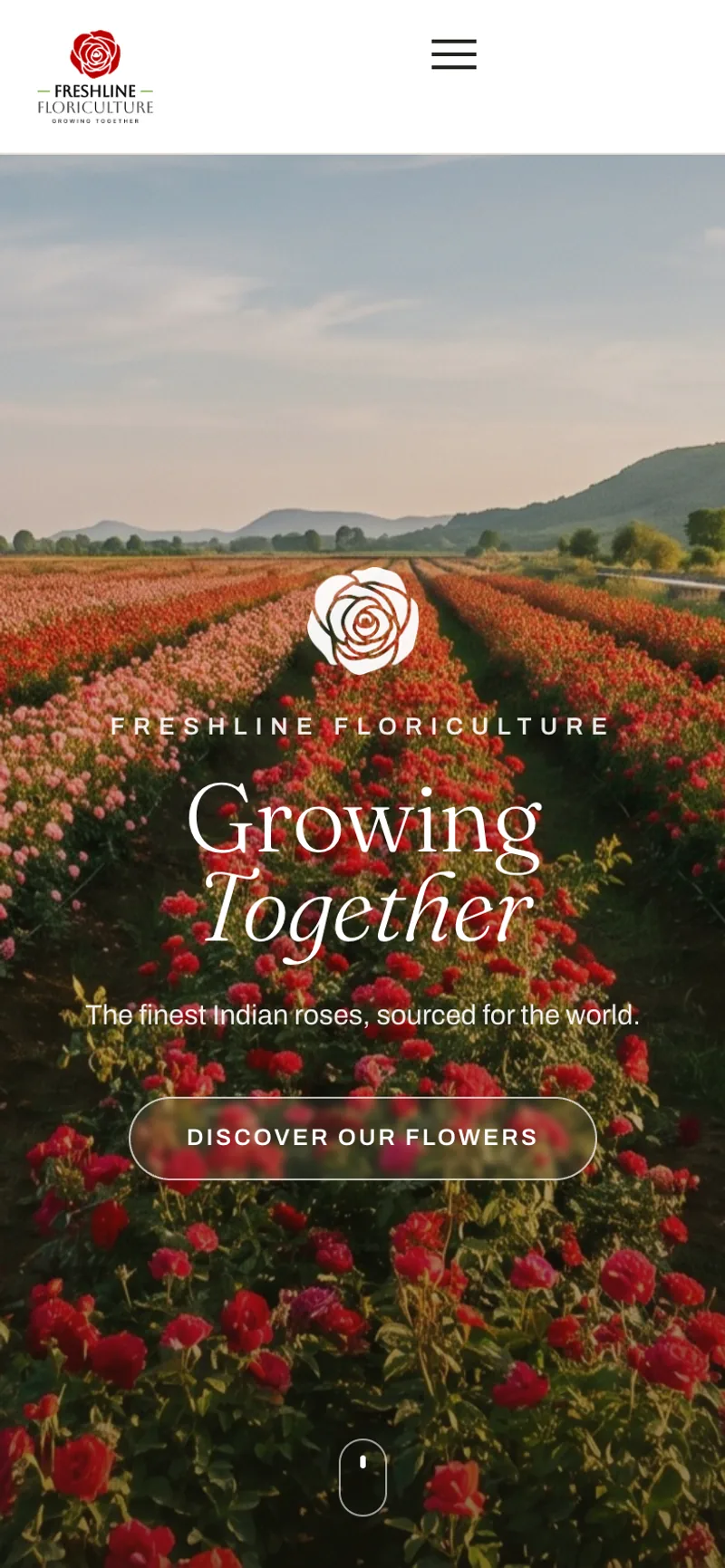
The page opens on the farm — rows of roses running to the hills — then states the positioning plainly. Below it, four differentiators do the reassurance a marketplace listing never could.

The work, and the flowers.
Two sections carry the substance — what Freshline actually does, and what it grows. The variety slider is built entirely from the client's own photography, two blooms at a time.
Proof, and a reason to reach out.
The grower community, the cold-chain promise, and a single quiet call to action. No urgency timers, no pop-ups — just the case for a conversation.

Mobile, where the buyers actually look.
Every section was built to stack cleanly on a phone — the differentiators fold to a two-up grid, the variety slider drops to one-up with dots, and the navigation collapses to a full-screen sheet.
The impact.
A brand that finally looks like the business behind it — credible to a corporate buyer, fast on a phone, and simple enough for a small team to own.
For the business
- A credible direct presence — a brand-owned surface that positions Freshline as an established grower, not a line item on a marketplace.
- Identity applied end-to-end — the rose mark, the red-and-green palette, and the editorial type carried from nav to footer.
- Own photography, front and centre — the client's rose varieties showcased in a purpose-built slider.
- Deployable in minutes — a static bundle with no build step, hosted anywhere, handed over with full documentation.
For the buyer
- The offer in one scroll — who Freshline is, what they grow, and why to trust them, without hunting for it.
- Four clear reasons to buy — traceability, timely delivery, freshness and quality control, each with its own mark.
- A fast, calm page — WebP imagery, progressive enhancement, reduced-motion support, and not a single dark pattern.
- Considered on mobile — stacked, tappable and readable on the device most buyers open first.
Have a brief?
If you've got a brand that lives on someone else's marketplace and needs a home of its own, that's exactly the kind of build we like.
Start a project

